


- May 2015 (1)
- September 2014 (1)
- August 2014 (5)
- July 2014 (4)
- June 2014 (5)
- May 2014 (3)
- April 2014 (4)
- March 2014 (4)
- February 2014 (4)
- January 2014 (8)
- December 2013 (5)
- November 2013 (5)
- October 2013 (3)
- February 2013 (1)
- March 2012 (1)
- February 2012 (5)
- January 2012 (6)
- April 2011 (1)
- November 2010 (2)
- October 2010 (2)
- August 2010 (2)
- July 2010 (1)
- July 2008 (1)
- November 2007 (1)
- May 2007 (1)
The eBiz BlogIf you enjoy our posts, please share them using the social media options to the left or end of each post. Wednesday, March 19 2014
By the same token, when the typography is subpar, it’s noticeable. The wrong font, too many fonts, too big or too small, the wrong color, the wrong placement — there are a million ways typography can go wrong. And when it does go wrong, you could be losing customers who either can’t or don’t want to look at your website. Some experts argue Web design is 95 percent typography, and if you understand the elements of typeface, fonts, spacing and sizing, you have everything necessary to design attractive websites. Obviously, there is more that goes into building a beautiful and functional webpage (and when you choose the best online store builder, much of that work is done for you) it’s still important to understand at least the basic principles of typography to avoid driving your customers away. The Effects of Poor TypographyWhen your typography is poor, it’s hard to read. When your site is hard to read, visitors are going to either leave, thereby sending your conversion rate down and bounce rate up, or struggle through the page and end up exhausted or annoyed. Your content might be on point and useful. But if it’s hard to read, no one is going to share it. You might even become the victim of poor word-of-mouth as visitors say “Sure, the site is great — if you can actually read it.” That’s why you need to follow a few best practices when designing the typography for your site:
Above all, keep your website text legible and readable. If you’re thinking about changing your fonts, or wondering if different typography would improve conversions, perform an A/B test to try different combinations. It may seem like a small thing, but by paying attention to your typography, you can find customers who are just your “type.”
Image by XxRobbieChaosxX used under a Creative Commons Attribution-No Derivative Works 3.0 License. Comments:
|
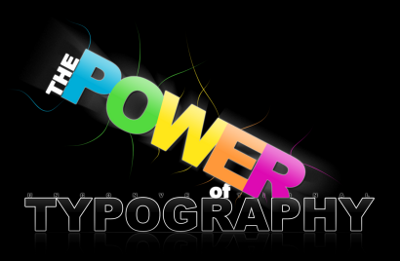
 Typography is the way the letters of your text appear on your website pages. Great typography is something you know when you see it. Whether it’s a webpage, a brochure or some other marketing piece, when the typography is great, it just works.